Neutrals have never been more exciting than they are right now.
If you think neutral means beige walls and a grey sofa and nothing else going on, 2026 is about to change your mind completely. The neutral interiors trend has evolved far beyond the safe, sterile minimalism of the early 2010s. Today’s most beautiful neutral living rooms are layered, warm, textured, and deeply personal — and they are dominating every interior design platform from Pinterest to Architectural Digest.
This guide breaks down the best neutral color palettes for living room decor in 2026, explains why they work, and shows you exactly how to bring them to life in your own home with the right furniture, textiles, and finishing touches.
The shift toward neutrals is not a trend born from a lack of creativity. It is the opposite. Homeowners and designers alike have realized that a neutral foundation is actually the most creative canvas you can work with — because the story gets told through texture, material, and layering rather than through loud color choices that date quickly.
There is also a psychological dimension. In a world that feels increasingly overstimulating, the home has become a sanctuary. Neutral palettes create rooms that feel calm, grounding, and restorative — qualities that are genuinely sought after in 2026 more than ever before.
The result is a generation of living rooms that feel warm and intentional without ever feeling cold or generic.
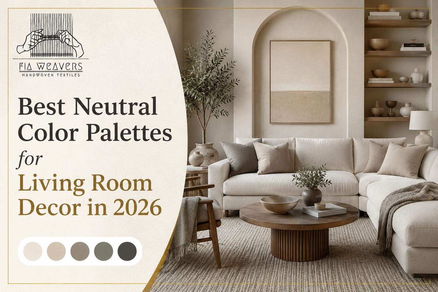
This is the palette of 2026. Warm sand walls — think a soft, sun-warmed beige rather than a flat off-white — paired with raw linen furniture and natural fiber accents creates a living room that feels both effortless and deeply considered.
The key to making this palette work is variation within the neutrals. Sand and linen are not the same color. One reads warmer, one reads cooler. Placing them together creates subtle contrast that keeps the room visually alive without introducing a competing color.
Bring it to life with: A sand-toned linen sofa, raw woven cotton throw pillow covers in cream and warm white, a jute or hand-woven area rug in a natural undyed tone, and wooden furniture with visible grain.
This palette has been building momentum for several years and reaches its peak sophistication in 2026. It is earthy without being rustic, warm without being overwhelming, and rich without requiring bold color confidence.
Terracotta and clay are technically neutrals in the context of interior design — they are earth tones derived from natural pigments, and they behave like neutrals when used alongside warm whites and natural wood.
Bring it to life with: A warm white sofa or walls as the base, terracotta and clay-toned throw pillow covers layered in varying textures, a hand-woven rug in a warm rust or undyed natural tone, and ceramic or rattan accent pieces.
For those who want a more urban, sophisticated take on neutrals, this palette delivers quiet luxury. Mushroom — a grey-brown with warm undertones — anchors the room. Taupe floats above it, and soft charcoal adds depth without darkness.
This combination is particularly effective in apartments and smaller living rooms because the tonal relationship between the three colors creates the illusion of more visual space.
Bring it to life with: A taupe or mushroom-toned sofa, charcoal and warm grey woven pillow covers, a low-pile area rug in a tone-on-tone geometric weave, and brushed brass or matte black metal accents.
This is old-money neutral — the palette of beautifully aged spaces that feel like they have been curated over decades rather than styled in an afternoon. Ivory provides luminosity, camel adds warmth, and chocolate grounds everything with richness.
This palette is particularly well-suited to rooms with natural wood floors and high ceilings, where the warmth of the color family prevents the space from feeling cold or echoey.
Bring it to life with: An ivory or cream linen sofa, camel and chocolate woven pillow covers in natural cotton or wool, a large hand-knotted area rug in a warm brown or ivory ground, and layered wooden shelving with warm-toned objects.
The most organic palette on this list. Sage — a muted, grey-green with earthy undertones — brings a breath of the natural world indoors without the loudness of a bolder green. Stone grey provides structure. Natural white keeps the palette light and fresh.
This combination has particular appeal for those drawn to the organic modern aesthetic that is defining 2026 interiors — spaces that feel connected to nature, grounded in natural materials, and calm in their visual rhythm.
Bring it to life with: Stone or natural white walls, a sage or natural green woven accent pillow cover, a stone-grey and ivory area rug, linen drapery, and an abundance of indoor plants.
The most common mistake people make with neutral palettes is treating them as flat. They choose one neutral and apply it uniformly across the room, which results in a space that feels bland rather than beautiful.
The secret to a stunning neutral living room is tonal layering — using multiple shades within the same neutral family, each in a different material, to create depth through texture rather than color contrast.
Think of it this way: a room with five different beiges is infinitely more interesting than a room with one beige repeated five times. The key is that each beige needs to be in a different material — a plaster wall, a linen sofa, a woven cotton pillow, a jute rug, a ceramic lamp base.
Rules for layering neutrals:
In a colorful room, textiles are accents. In a neutral room, textiles are everything.
When you remove color contrast as your primary design tool, fabric becomes the language through which your room tells its story. The weave of a pillow cover, the pile of an area rug, the drape of a curtain panel — these are the details that make a neutral room feel rich and designed rather than empty and unfinished.
This is why the quality and character of your textiles matters so much more in a neutral scheme than in any other. A machine-printed pillow in a standard polyester blend will look flat and lifeless against a neutral sofa. A handwoven pillow cover in a natural cotton, with its subtle variation in weave and tone, adds the kind of organic depth that no mass-produced piece can replicate.
At FIA Weavers, our handmade pillow covers and area rugs are designed specifically to work within neutral palettes — adding texture, warmth, and artisan character to any living room scheme.
A neutral living room does not mean an accessory-free one. The right accent pieces complete the palette without disrupting its calm.
Natural materials always win. Wood, rattan, jute, ceramic, stone — these materials carry their own neutral tones and add character without introducing competing color.
Greenery is a neutral. A large fiddle leaf fig or a cluster of trailing pothos adds visual relief and a sense of life without breaking the palette. In the context of a neutral room, plants read as natural accents rather than color statements.
Warm metals anchor the room. Brushed gold, antique brass, and warm bronze all complement earth-tone neutrals beautifully. Avoid cool chrome or silver in a warm neutral scheme — the temperature clash is subtle but noticeable.
Books and objects tell the story. A neutral room gives your objects room to speak. Stack books with neutral or natural spines, display ceramics in tonal groupings, and let a few meaningful objects do more work than a cluttered shelf of many.
The best neutral living rooms in 2026 are not beige because they ran out of ideas. They are neutral because they understand something fundamental about how beautiful spaces work: restraint in color creates space for richness in everything else.
Choose your palette from the five options above, layer your neutrals in different materials, invest in high-quality natural fiber textiles, and let texture do what color usually does. The result will be a living room that feels calm, warm, timeless, and genuinely designed — a space that looks as good in five years as it does today.
Explore FIA Weavers‘ handmade pillow covers and area rugs — all designed to work beautifully within a neutral palette and bring genuine artisan warmth to your living room.